QIAGEN IPA
New Feature: Comparison bubble map in IPA Interpret
35 views
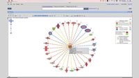
The Spring 2026 release of IPA introduces the Comparison Analysis bubble map to IPA Interpret. This feature lets users compare multiple treatments, diseases, cell types and other experimental conditions in a single, customizable and interactive graphic.
With support for up to 50 IPA Core Analyses, this bubble map also shows all scored entities – Upstream Regulators, Canonical Pathways and more – in one matrix, a huge step from IPA Desktop, which caps at 20 analyses and shows only one entity type per heat map.
You will learn:
> To set up comparison analysis in IPA Interpret
> To use bubble colors, size, filters, sorting and other features to drive discoveries
> To open pathways and networks represented by bubbles in comparison analysis to generate strong hypotheses
Related videos

Discover why QIAGEN Ingenuity Pathway Analysis (IPA) is more than just...

Learn how to view and interpret your comparison analyses results in IPA and...

New user training: Large dataset analysis and knowledge base queries using...
Learn how to view and interpret your Phosphoproteomics Analysis results in...